How to Use Greenery, Pantone’s Color of the Year
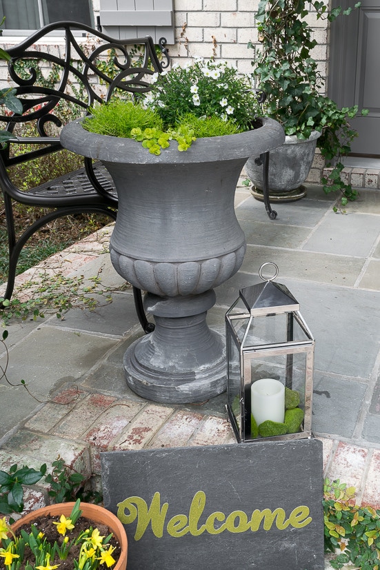
So, don’t feel bad if you have no clue who ‘Pantone’ is and why you should even care about ‘Greenery’. In all honesty, I didn’t either until 3 weeks ago when my friend Sherry made this rather innocuous observation on the post I did about my ‘mossy’ Spring Front Porch.
Sherry’s comment was,”I love the color of moss. I think it is so pretty and it looks exactly like Pantone’s color of the year, “greenery””.
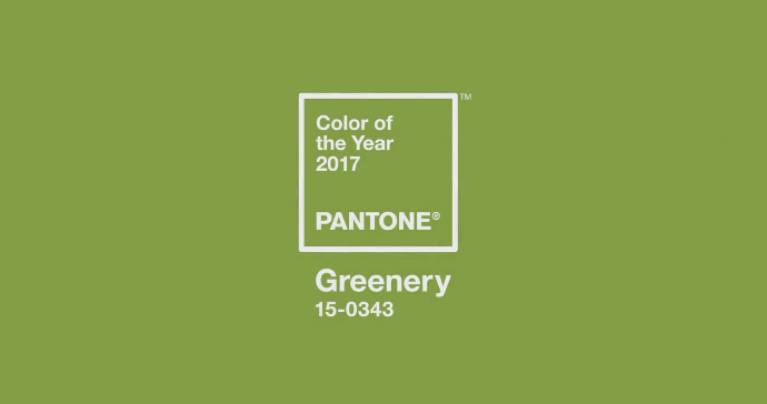
Of course, having an ‘inquiring mind’ I immediately plugged the word ‘Greenery’ into the Googler, found out it was designated by Pantone as the ‘Color of the Year for 2017’, discovered who exactly Pantone is and why this Springy Green color earned such a lofty title.
In a very little nutshell, Pantone is in the Color business and is best known for it’s Pantone Matching System (PMS) which simply standardizes colors for all applications. If you wanted to print a brochure and wanted to be a certain blue, you would communicate a standardized color to the printer. This standardized systems removes errors that can result from interpreting the same color differently among different devices and mediums. A certain blue would look different on my computer than it would yours or if it were on printed matter.
For instance, they have standardized the color of the iconic Tiffany’s box as ‘1837 Blue’, 1837 being the year that Tiffany’s was founded. ‘Minion Yellow’ has been standardized such that if you need it, you can get the exact yellow for your next Minion costume.
In addition, for the past 17 years, Pantone has studied travel, fashion, food and cocktails, politics, pop culture, sports, technology and social issue and spoken with historians, designers, architects and clients to get a feel for future color trends. Their color forecast is used in every way imaginable, from home goods to wedding decor to the fashion runway.
The color chosen for 2017, “Greenery” was chosen , as Pantone puts it, because:
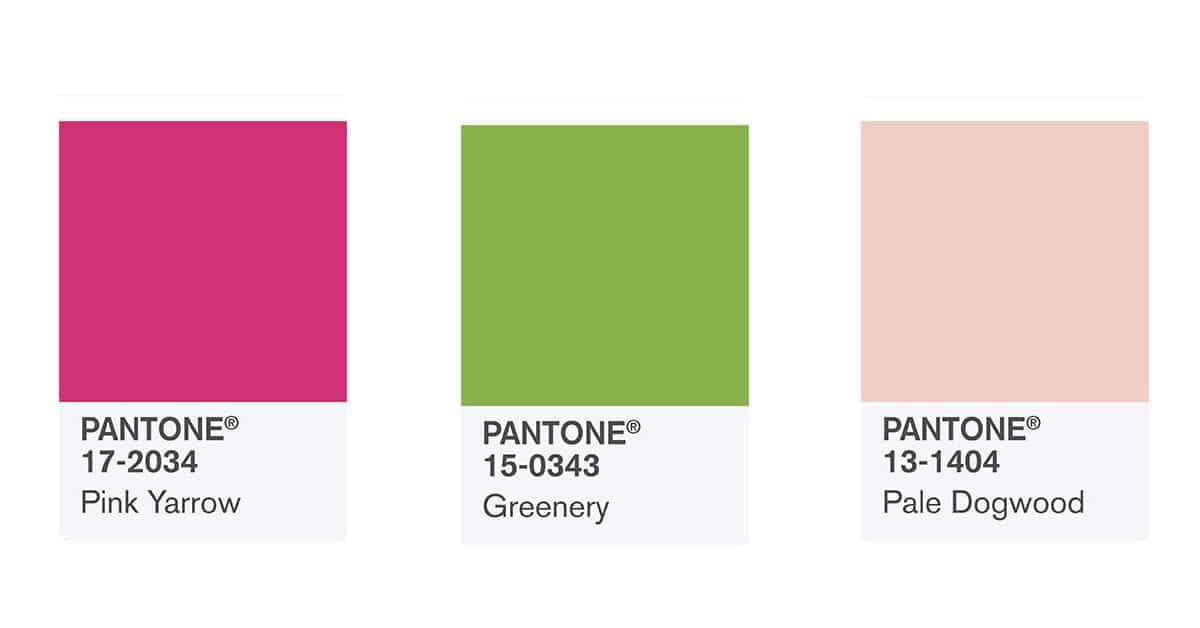
The folks at Pantone not only brought us ‘Greenery’, but an entire palate of complimentary Spring colors. Two of my girlfriends have put together suggestions for using two of those colors, “Pale Dogwood” and “Pink Yarrow” in your home and wardrobe. Links to their posts are at the bottom of the page.
So, where to start with bringing Greenery into your home?
Just a heads up…this post is light on words and heavy on lovely images…some Weekend Eye-Candy! I have indicated the sources (to the best of my ability) under each image. If you want to pin the image, please go to the source shown…Muchas Gracias.
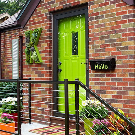
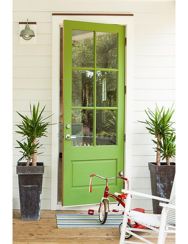
Let’s start at the logical front of the house with some great green front doors! Clearly this a bigger ‘Greenery’ commitment, but it surely makes a lovely green pop!
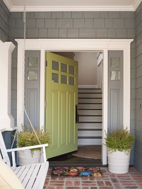
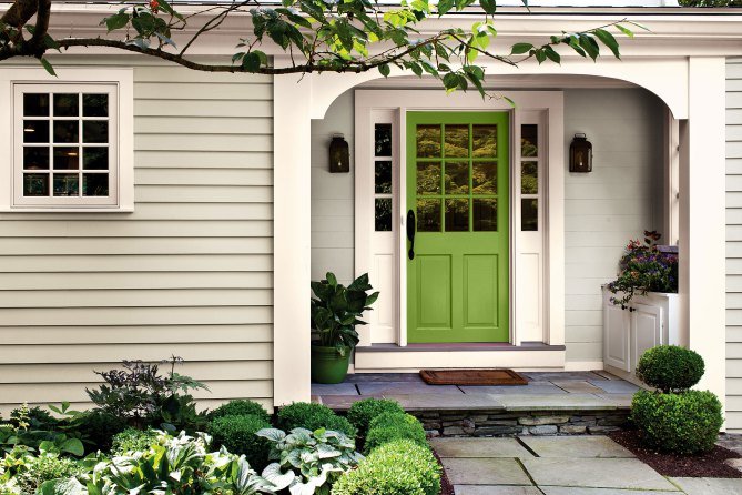
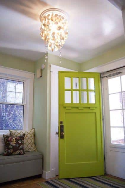
By far, the easiest way to do it would be a ‘Captain Obvious’ suggestion…bring some greenery in the form of houseplants, clippings and flowers into your home, both faux and real:
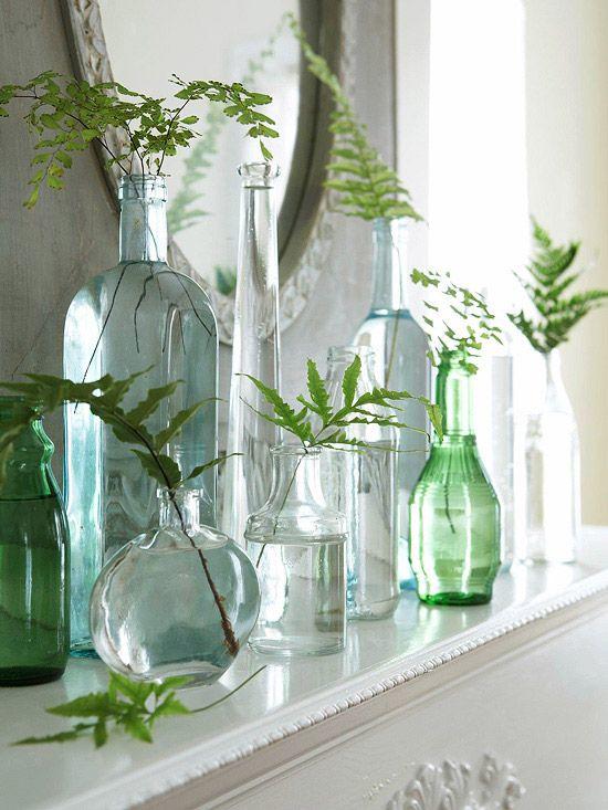
Simple Fern fronds in glass bottles…image source
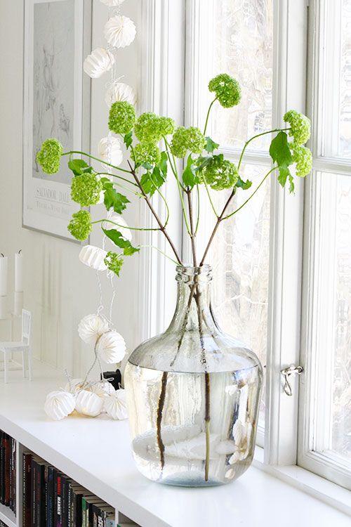
Limelight Hydrangeas…image source
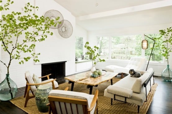
Branches in large vases…image source
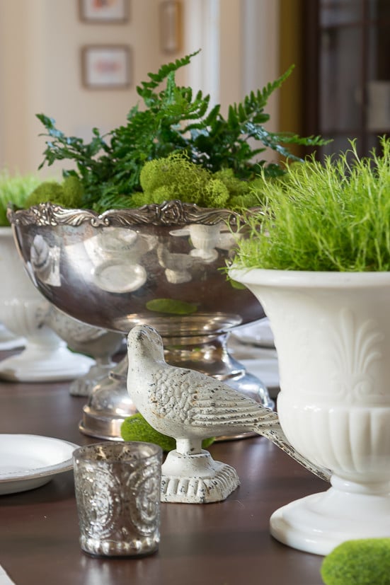
Scotch Moss, Ferns and Reindeer Moss
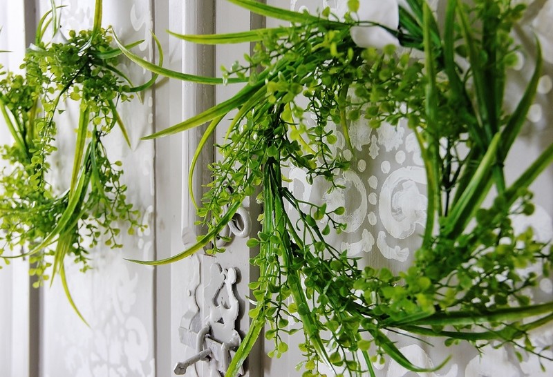
Faux Greenery Wreath…Thistlewood Farms
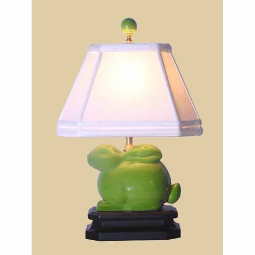
You could easily add a few pillows, throws or other decorating accessories to your existing decor.
Some of these are affiliate links and I will earn a small commission off of the sale of these products, but the price you are charged is not affected. You can see my full disclosure policy here.
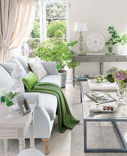

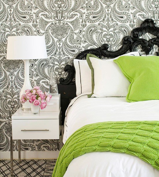
Image Source (I am not 100% sure this is the original source but I can’t for the life of me find it. If you know the original source, please let me know so that I can give them proper credit.
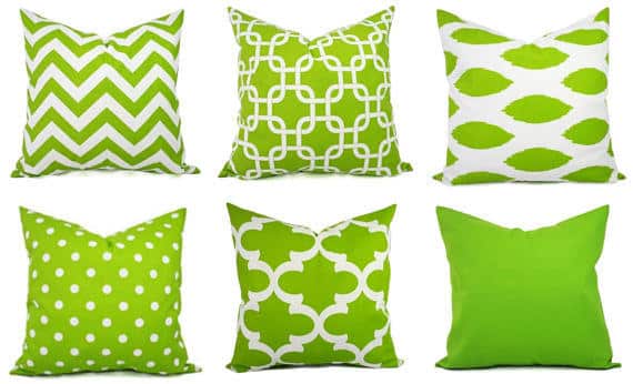
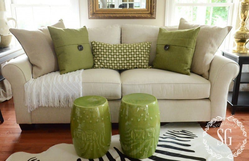
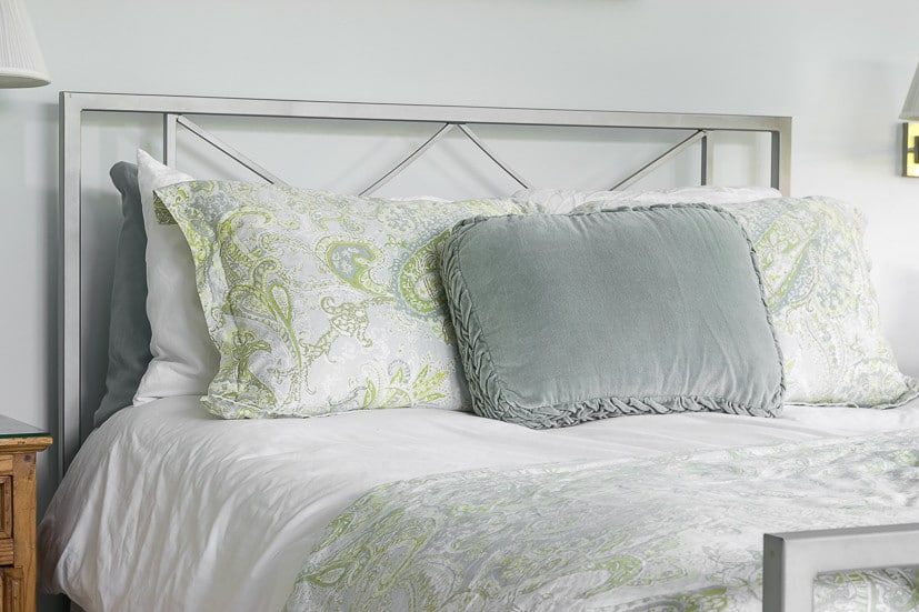
Our master bedroom is primarily blue with little shots of green and up until this point I have really only emphasized the blue.
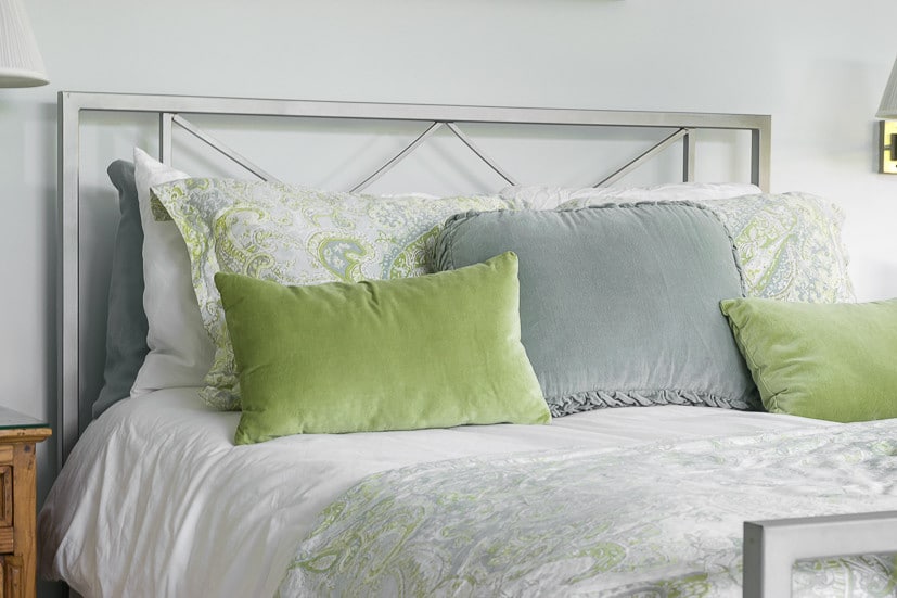
However, with my eyes being opened to the freshness of ‘Greenery’, I recently brought in 2 green velvet pillows and love how this simple addition has really brought a little something to my bedding.
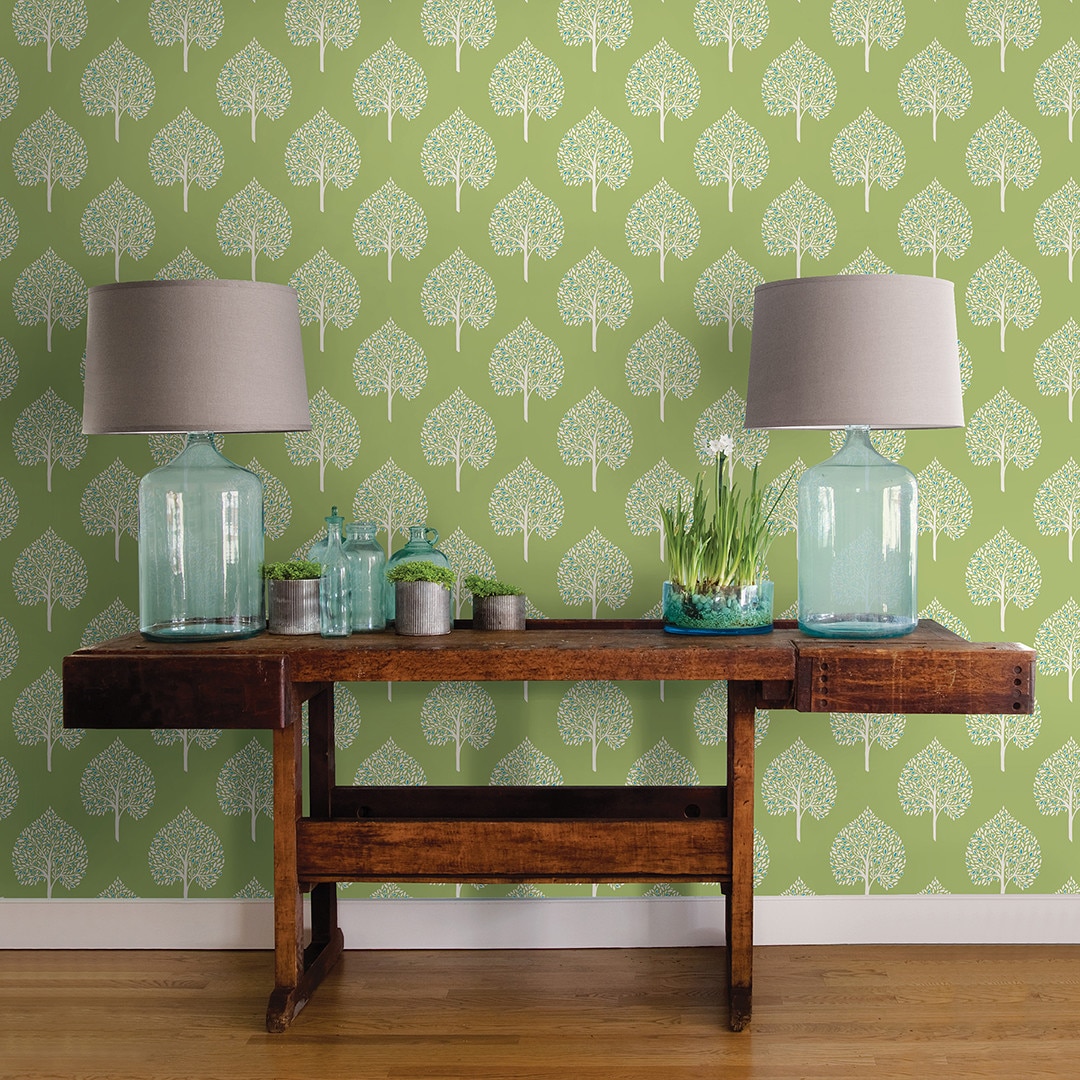
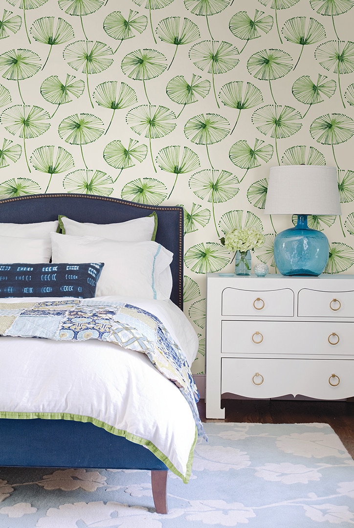
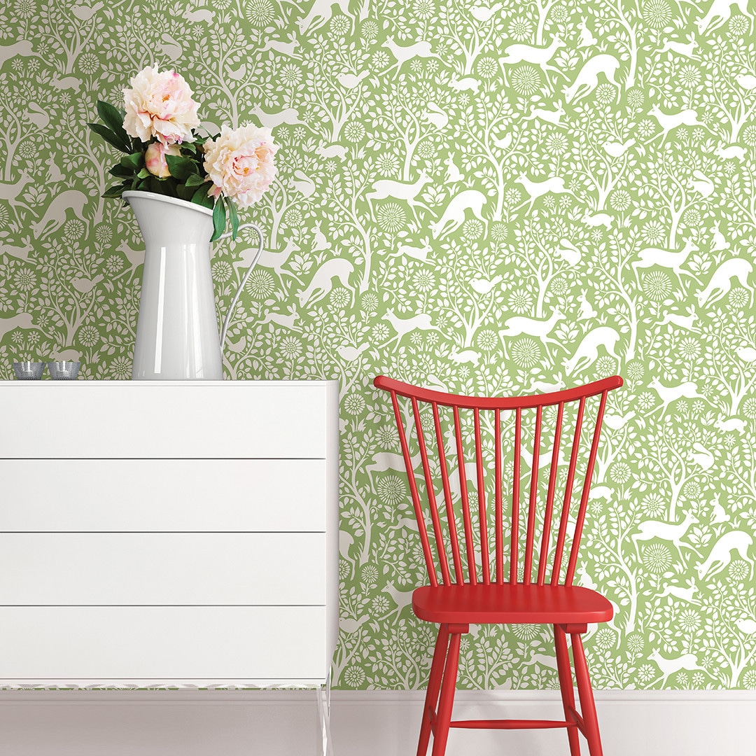
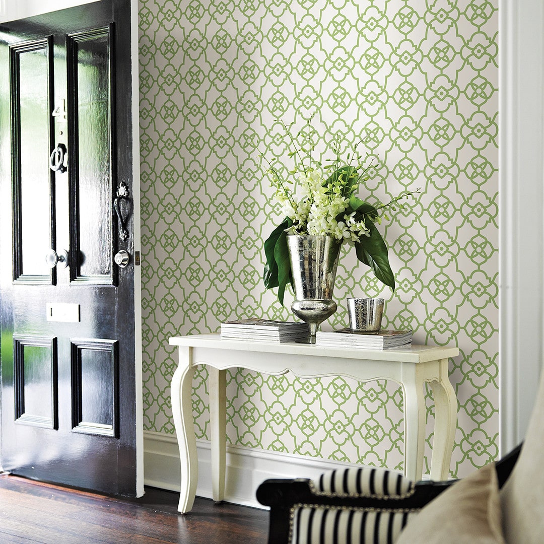
If you wanted to go ‘full greenery mode’, you could incorporate some of these lovely wallpapers in your home.

OK, I could go on forever, but at the risk of Greenery overload, I’ll stop here. But don’t forget to pop over and see Sherry’s board for the vibrant “Pink Yarrow” and Nicki’s suggestions for using the sublime “Pale Dogwood“.
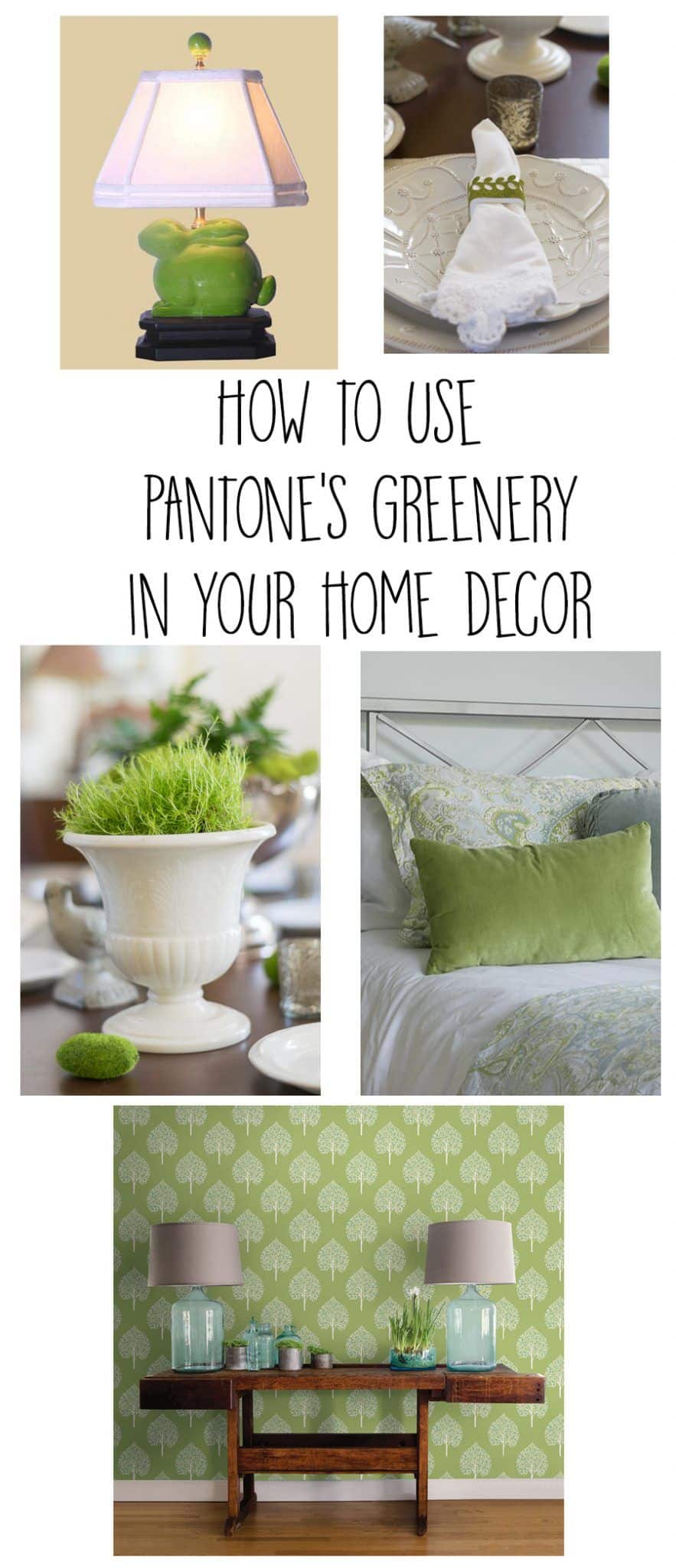
Pin this for future reference.
It’s funny, since starting this little ‘Greenery’ project I have begun to notice the color EVERYWHERE! There was commentator on a news show yesterday morning sporting a tie that was clearly in the ‘Greenery’ vein.
And while Greenery is surely a harbinger of spring, you can easily see how it can work into your home decor year-round.
So there you go, a visual dissertation on ‘Greenery’, Pantone’s Color of the Year for 2017. I imagine that, like me, if you really hadn’t paid attention to it before, you will find that you will notice it everywhere now.
Thanks so much for stopping by to visit today; I appreciate it more than you’ll ever know. If you want to see what I’m up to from week to week, sign up here to sign up for updates.
I have published printable PDFs of several of my most popular knit patterns and printables and have made those available to all of my subscribers. Come back and check every now and again. I will continue to add patterns and printables to this page as we go along.
So, if you’d like to get in on the ‘subscriber benefit’ action, simply subscribe to Nourish and Nestle using the form on the right sidebar. It’s towards the top a bit. I have sent all my subscribers the link to the Subscriber Benefits Library, but if you missed it or misplaced it, drop me a line.
Hugs,



You have so much lovely inspiration packed into this post Lynn! You definitely have made me want to add some of this color into my life, thank you!
Thanks Nicki…I love that Pale Dogwood color too. After doing this post, I am so aware of all these colors now.
Thanks Nicki! I love this color and have enjoyed putting into action in my home. Now I’m looking for even more ways to use it.
Thanks for stopping by.
Hugs, Lynn
I love the color green and I have no idea why I haven’t used it since we moved here. Anyways, our red painted cottage has a bright lime green door that I painted many years ago and I still love it. Maybe in the next round of major decorating I’ll change things.
Oh, I can imagine how beautiful a lime green door looks on your red cottage! I’d love to see a picture.
I am glad I mentioned the color to you! I love the information that you gave us about Pantone. Thank you for sharing this because you have given me some great ideas of how to bring Greenery into my home.
I am so very glad you mentioned ‘Greenery’…it is such a lovely and vibrant color. Hope you have fun using it in your home.
Hugs, Lynn
I have a serious crush on this color right now and love the way it can naturally be incorporated into existing color schemes. Some of the other colors are a little more challenging to incorporate. 🙂 I might even be eyeing a few things in this color for our new house!
Hey there girlfriend…Isn’t it a lovely color!? I’d love to use more of this color too…I have never been much into wallpaper, but some of those patterns are just scrumptious!
Can’t wait to see what you end up doing in your new home.
Hugs, my friends…Lynn
Hi Lynn, I too just love the vibrant freshness of the greens shown. The doors are awesome! Thanks for the journey through such delightful images ?
Thanks Christine! It’s funny, I’ve always been drawn to this color but didn’t really realize it until I did this post…and now I find that I want to have it all through my house. As you said, just so fresh.
Thanks for coming by.
Hugs, Lynn
Lots of eye candy here Lynn! I had noticed that greenery was the color of the year. But clearly you went the extra mile and explained who Pantone is, and I thank you for that because I had no clue at all. I agree with you about the previous years’ colors not being so exciting. This one makes me happiest. You know for years I fought my natural inclination towards green. Even thought it has been my favorite color since childhood I almost never wear it nor have it in my home. Can it be that subconsciously I want to preserve it in nature? Food for thought. Anyway your selections are fabulous. Make me want to put wallpaper all over the house, and that is saying something!
Hi Mary, this post made me realize that I am naturally drawn to this color as well and made me see that I have had pops of it in my home for years now. It was a fun post to put together.
Thanks for popping by my friend.
Hugs, Lynn